Hi there! You are currently browsing as a guest. Why not create an account? Then you get less ads, can thank creators, post feedback, keep a list of your favourites, and more!
Lab Assistant
#26 Old 3rd May 2009 at 11:07 AM
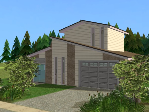
I don't like any of these, personally. There are still too many different textures (4 in picture 3) and I don't know anyone who has bathroom tiles on the outside of their house. I preferred the original taupe and white - but either taupe siding or white siding with the brick, not both, ie: just 2 colours or textures.
Advertisement
Instructor
#27 Old 3rd May 2009 at 11:28 AM
^ agreed
world renowned whogivesafuckologist
retired moderator
#28 Old 3rd May 2009 at 11:37 AM
Agreed here too - I liked the white/tan, just without the random mishmosh of textures. Imagine your house made of blocks - there's about four of them - kitchen/garage, living room, ground floor bedrooms/bathroom, and then the upper story. Paint each of those blocks one whole colour, and you can repeat colours. So maybe the beige brick for the garage/kitchen and bedrooms/bathrooms blocks, and white siding for the living room/upper story blocks.

This may also just be a matter of personal preference, but I find the colours of the master bedroom and the smaller bedroom sort of clash with the rest of the house. Now, IRL, it's not uncommon for particular rooms to not match the rest of the house, but for sim houses I like there to be a lot more of a match between the whole house. I think sticking with that whole beige/brown/tan/white comfy retro/modern look would be more effective than switching to the black/red/white sleek modern look.

my simblr (sometimes nsfw)

“Dude, suckin’ at something is the first step to being sorta good at something.”
Panquecas, panquecas e mais panquecas.
Instructor
#29 Old 3rd May 2009 at 12:28 PM
HP is completely right- I agree with her too!

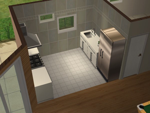
Oh- I just noticed the kitchen is a little tight atm,

All you have to do is change the stove around so its more open and maybe even move the fridge up 1 the sink across and down 1.. here I'll show you,


Oh and I dunno about the fireplace in the artist loft thingy. Not sure about it.. maybe replace it with something more fitting or change it to a lounge area with chess in the corner if its big enough or something.
Screenshots
Lab Assistant
Original Poster
#30 Old 5th May 2009 at 9:28 AM
Default made the changes
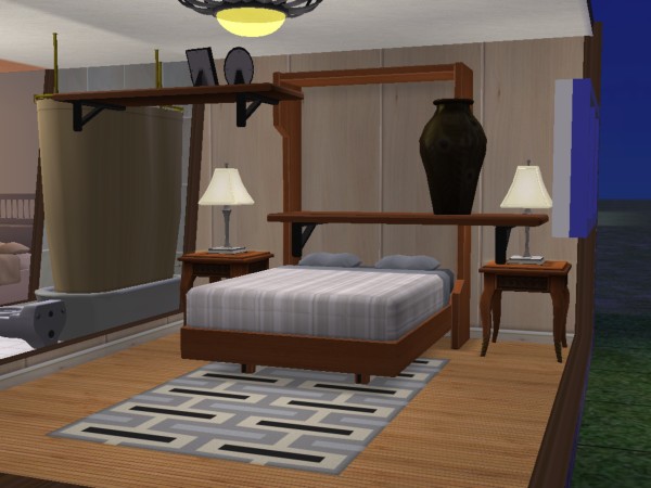
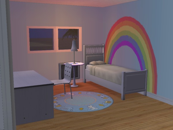
i made the changes, I change the siding to more of a cream colour: The first bedroom i think matches the house: the second bedroom i made into a kids bedroom so it does not match the house: so what do you think:
Screenshots
Field Researcher
#31 Old 5th May 2009 at 9:33 AM
It looks better, but the siding/stone on the exterior still seems rather random. Someone suggested that you take each module of the house and gives that one of the two treatments. That's a very good suggestion.

The adult bedroom has a mix of antique type furniture (bed tables and desk lamps) and more modern pieces. Since it'll go better with the overall feel of the house, you should go for all modern.

I like the kid's room but maybe try with a different lamp

for more of my lots check out my blog: smmishing.wordpress.com/
Lab Assistant
#32 Old 5th May 2009 at 1:49 PM
I agree with what smmi73 says.

The internal furnishing is incohesive. It's much better to pick a style and stick with it. I really like the kids bedroom, but I think it needs a different lamp and the other bedroom needs some more modern looking sidetables and lamps.

The exterior is still rather random. There are a couple of houses down the street next to mine that are the same kind of shape as your (without the upper floor) and they have bold panels of brick and siding - not stripes. I think it would translate to your house by removing all the siding by the garage door and just have the siding highlight the windows, and for the other side maybe just have it highlighting the front door.

Can we see what it looks like with the upper floor in just brick, please?
Lab Assistant
Original Poster
#33 Old 6th May 2009 at 6:33 AM
Quote: Originally posted by TaxWench
I agree with what smmi73 says.

The internal furnishing is incohesive. It's much better to pick a style and stick with it. I really like the kids bedroom, but I think it needs a different lamp and the other bedroom needs some more modern looking sidetables and lamps.

The exterior is still rather random. There are a couple of houses down the street next to mine that are the same kind of shape as your (without the upper floor) and they have bold panels of brick and siding - not stripes. I think it would translate to your house by removing all the siding by the garage door and just have the siding highlight the windows, and for the other side maybe just have it highlighting the front door.

Can we see what it looks like with the upper floor in just brick, please?
when you mean bold colours do you mean colours like orange,yellow,red
Screenshots
Field Researcher
#34 Old 6th May 2009 at 8:46 AM
The last pics looks really good. If you just put some white/light siding or poured wallpaper where there's orange siding now it'll be perfect.

for more of my lots check out my blog: smmishing.wordpress.com/
Lab Assistant
#35 Old 6th May 2009 at 1:55 PM
I meant bold panels, Thefox18. What you've done in the last picture is great - much more realistic, but you should change the siding colour to a pastel or white or cream.
Lab Assistant
Original Poster
#36 Old 8th May 2009 at 7:56 AM
Default made changes
i made the changes:
Screenshots
Lab Assistant
#37 Old 8th May 2009 at 12:58 PM
I think it looks great! Good luck.
Lab Assistant
Original Poster
#38 Old 9th May 2009 at 12:20 AM Last edited by Thefox18 : 10th May 2009 at 7:11 AM.
Quote: Originally posted by TaxWench
I think it looks great! Good luck.
Thanks, but i can't upload yet because i have a Upload restriction.So i can't upload until HystericalParoxysm lifts the band.So do you know how to get hp to lift the band
Lab Assistant
Original Poster
#39 Old 11th May 2009 at 9:36 AM
house enough
So do you think this is good enough for uploading here
Instructor
#40 Old 11th May 2009 at 9:37 AM
Yup! .
Lab Assistant
#41 Old 11th May 2009 at 10:47 AM
Definitely!
Coffee, anyone?
retired moderator
#42 Old 11th May 2009 at 7:40 PM
I think you have done a grand job on the house! Please post in Creator Issues regarding this issue and link to this thread.

I'm worried that my latest Salvation Army donation will result in homeless people looking like sluts from the 90s.
Lab Assistant
#43 Old 12th May 2009 at 8:50 PM
I like It a lot but you need some better wallpapers inside i have some hare Is the link http://nene.modthesims2.com/download.php?t=329284
Locked thread | Locked by: justJones Reason: do not delete-useful info
Page 2 of 2
Back to top